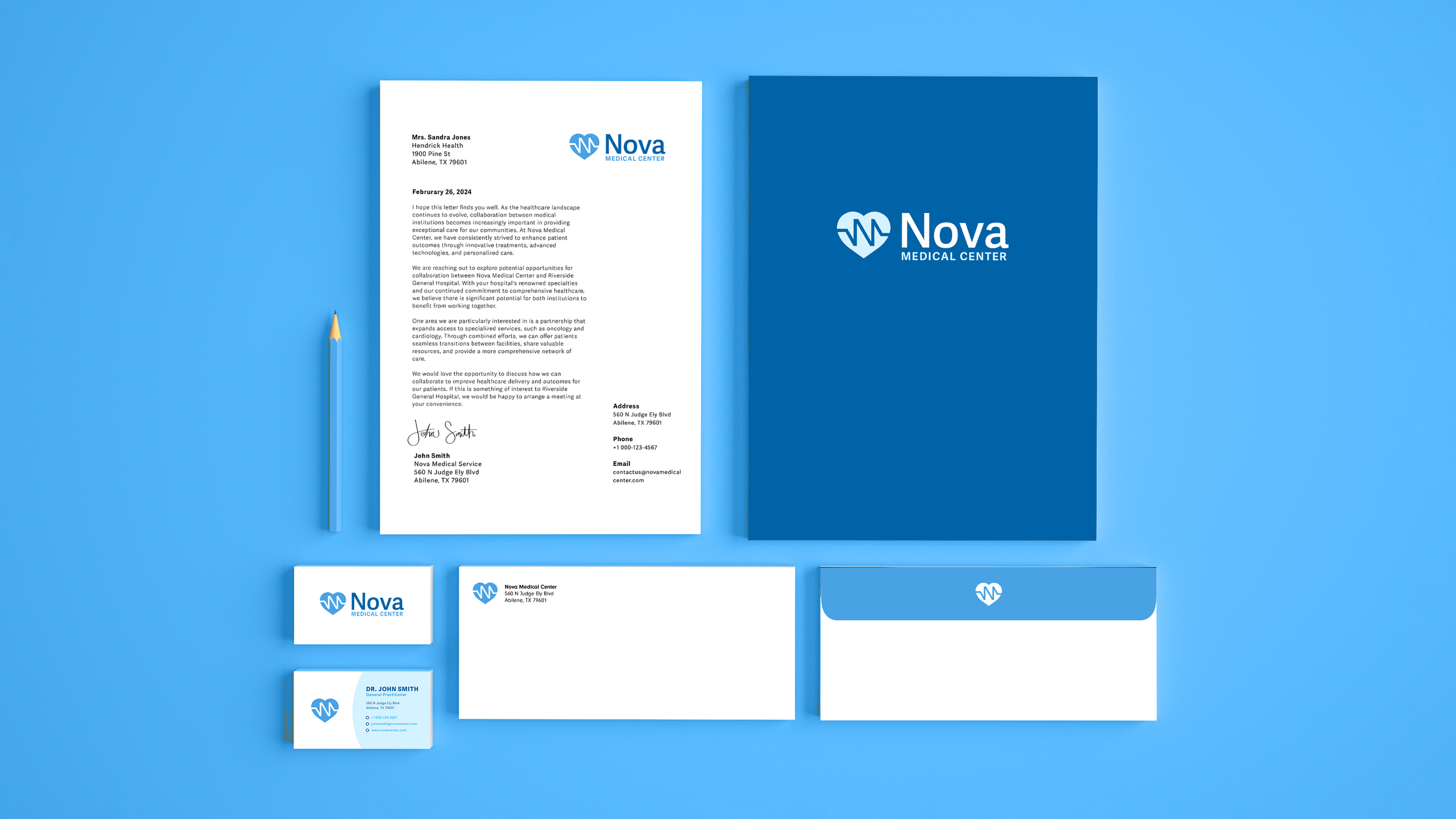

Nova medical center redesign
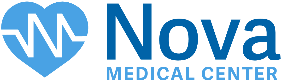
I redesigned the logo for Nova Medical Center to create a modern, professional identity that reflects the brand’s focus on healthcare. The original design was overly complex, so I simplified it with a heart icon using an electrocardiogram line that subtly incorporates the “N” from the logo type. Clean, cold typography ensures clarity, and the result is a sleek, approachable logo that aligns with Nova’s mission.

Wayfinding system
I created a clear, bilingual wayfinding system for Nova Medical Center, including primary elevator signage, secondary directional signs, room identifiers, and a custom icon set. The system uses a consistent typographic hierarchy and blue-toned palette to improve navigation and align with the center’s visual identity.
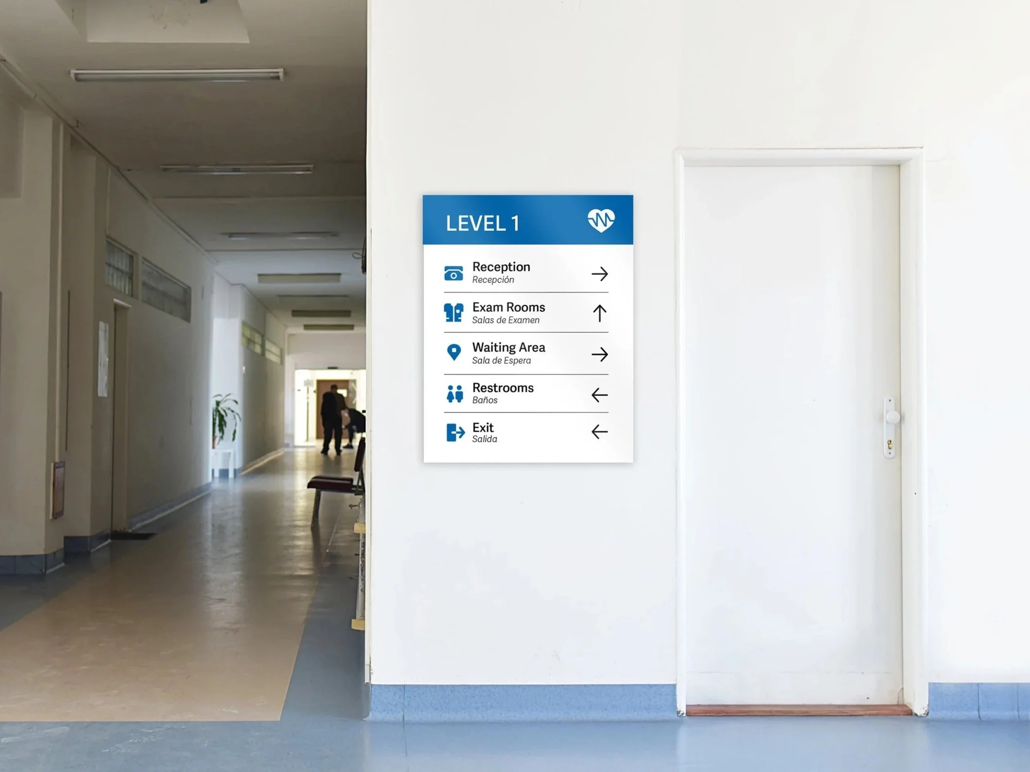


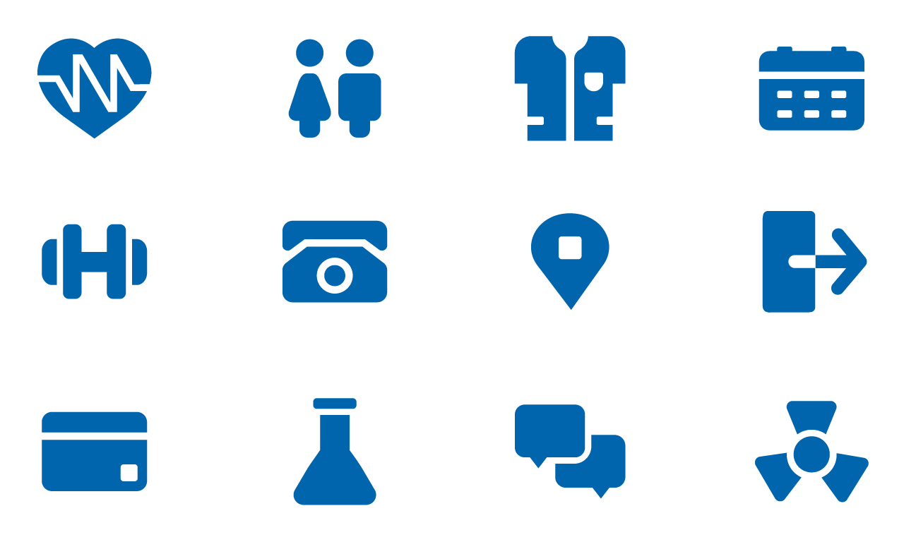
Icon System
Alongside the selected redesign, I created an alternative logo option to explore a different visual direction while maintaining the brand’s identity.
Logo option one

Logo option Two
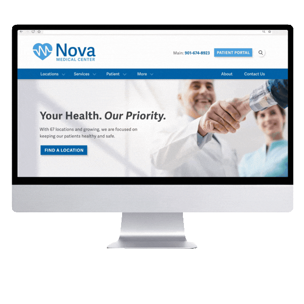
Website
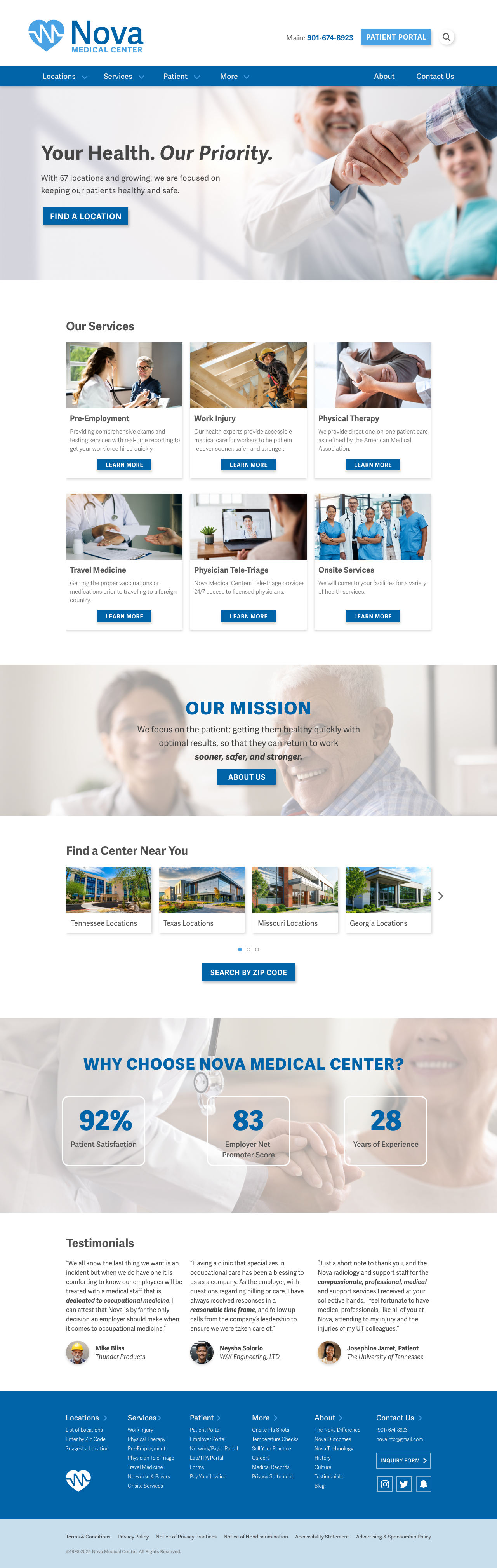
I designed a clean, accessible, and professional website featuring a streamlined user experience with intuitive navigation, ensuring that businesses and employees can easily find essential healthcare services.
A modern, responsive layout enhances usability across the device, while clear call-to-action buttons guide visitors to key resources such as location searches, appointment scheduling, and service details.